IS IT TIME TO UPDATE YOUR OLD WEBSITE?
AN 11-STEP CHECKLIST TO HELP YOU DECIDE

Websites aren’t static products. They must always be evolving.
Especially among small to medium-sized businesses and older business owners, there’s a mentality that websites are a completely static product. You place them on the web to sit without changes unless the business itself goes through a major overhaul.
The reality is that the most successful websites that drive traffic are never static. There are always new updates unfolding, be it fresh content to fill out its catalogue or a design overhaul to take advantage of new sales strategies. If you want to keep up with your market, you can’t be standing still. Even behind the scenes, websites should be receiving regular updates to keep them running smoothly and securely. These updates might be the type that no one but the maintenance team may ever see. However, when they’re missing, it will show with slower speeds, security breaches, or even a full website collapse.
Some of this isn’t feasible for smaller businesses working with a tighter budget, but you will still need updates and may be wondering: “when it is it time to update my website?”
If you’re asking this question or have never considered this question, here’s 11 signs it may be time. We encourage you to treat this as a checklist and at the end, tally up how many boxes you fill.
1. Your website has collapsed
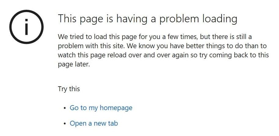
This one might sound pretty obvious, but here at Web Wolf Design, we’ve seen many businesses with websites that aren’t just damaged, but actually broken to the point where they have crashed and cannot display. More often than not, these owners aren’t even aware their website has collapsed because they haven’t checked it in years.

2. Incorrect information displayed
Perhaps you’ve made changes to your business since your website was created, such as to alter your operating hours, contact information, or even to move to a brand-new location.
If you haven’t updated your website to reflect this, you’re losing business by presenting yourself in a negative light. After all, if potential customers see it isn’t up-to-date, how can they trust that other aspects of your business are? Some might even believe your business has closed down and go elsewhere thinking the website they’ve found is a derelict relic of the past.
3. Broken links or images
When a website isn’t maintained (or is maintained poorly), existing links between pages on your often break. This causes a display error when users try to click them instead of showing the correct content.
Additionally, hacking bots that breach your website security will often edit your links so that when clicked, they take the user somewhere else entirely, typically to another (and usually inappropriate) site. This not only reflects poorly on your brand, but directly puts your users at risk because these sites are often filled with malware, viruses, or dangerous cookies that will damage their computers or steal their personal data.
While not every broken link or image means there’s a security breach, they do mean it’s time for some site updates.
4. Lacking security
Speaking of security, is your website running https protocols or carrying a valid SSL?
In case you’re not sure what that is, it wouldn’t hurt to have an expert look over your website. But even if you don’t want to hire an expert yet, there are a few checks you can do.
For starters, when you load your website, does the full URL at the top of the screen list “http” or “https” as the first few letters? If the prior, your security is lacking.
Next to the URL bar you might see a lock icon to show that the page is secure. If this is missing, your website lacks a secure connection and is a security risk. If a potential user lands on a site with that warning, you can be certain most of them are backing out right away.

5. Slow load times
According to studies run in 2023 by Neil Pate (a marketing advisor for companies such as NBC, GM, and HP), 47% of web users will lose patience with a website that takes more than two seconds to load. This means that if you’re website is slow, that is 47% of potential customers that are either outright leaving your site before it has a chance to show your business, or in a best-case scenario, coming to it in an annoyed mood.
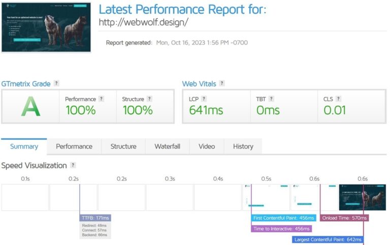
While speeds will always vary depending on device and network connections, a general way to fairly measure your speeds is to use a tool like GTMetrix, a third-party product which will tell you what your website’s load time is on a stable connection, along with other useful metrics.

6. Confusing layout
When a visitor lands on your site, they should know immediately what your business is and what it offers even if they’ve never heard of you before. The navigation needs to be intuitive and direct. This way they can easily find further information or engage with your call to action.
Judging a layout can often be tricky if you’re already familiar with it. This is why at Web Wolf Design, a part of our website creation process is to use beta testers on every site before launch. By observing how they interact with an unfamiliar site, we can identify points of confusion or frustration to address the problems early.
7. Old or poorly-framed pictures
Visual appeal is a core component of the battle to capture a viewer’s attention. Ugly photos of your operation will immediately turn away potential customers, cutting off an entire market of buyers you might have otherwise been able to convert into sales.
In contrast, quality photos will have users spending more time on your site and developing a deeper connection with your content.
8. Bland written content
Providing valuable information is one of the most critical purposes of any website. While a compelling photo can help capture a user’s eye, it is the written content that keeps them there to make a purchase or guide them to contact you. Many sites miss this mark by providing too little, too much, or unfocused information.
It goes without saying that typos and grammatical errors hurt your reputation, but did you know that optimized written content will boost your organic clicks from search engines too?
9. Years since a change
When did you last have your website designed or updated? A year ago? A few years? A decade?
The world is ever-evolving. Just as marketing strategies must adapt to keep up with people’s tastes, so too do websites. Cutting edge in 2015 is stale and outdated for 2020, and that will reflect how potential customers view your business.
Fresh content on your site also gives old users another reason to return, boosting engagement.
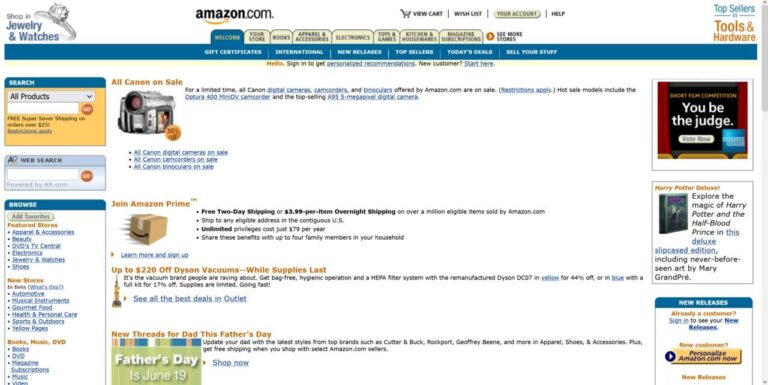
Hover over the boxes below to see how the eCommerce giant Amazon.com has evolved its website to stay modern:


10. Not mobile-friendly
Forbes reports that 60% of all website traffic comes from mobile devices. Older websites didn’t take this into account, and even many newer ones struggle with the task. Not only does lacking this deflect customers, but 74% of users say they are likely to return to a mobile-friendly website, doubling this feature’s benefit.
Always make sure your website is usable on a mobile device, and if not, it’s time for an upgrade.
11. Not optimized for search engines
Search Engine Optimization (SEO for short) refers to the process of tailoring your website so that it can be easily found by the bots that search engines like Google or Bing use to locate information. If your website is hard for these bots to crawl, your odds of showing up in a search decrease significantly.
What did you score?
How many checks from this list does your website include? Even if there are only a few, it means that it’s time for some updates. These might be small projects to cover simple fixes, or if the signs are significant, it might be time for a complete website overhaul.
It’s important to remember that this isn’t an all-inclusive list, but a shorter glimpse into some of the ways a website can fall short. If you’re interested in a more comprehensive and personal assessment of your unique website, the easiest way is through a free website consultation.


